
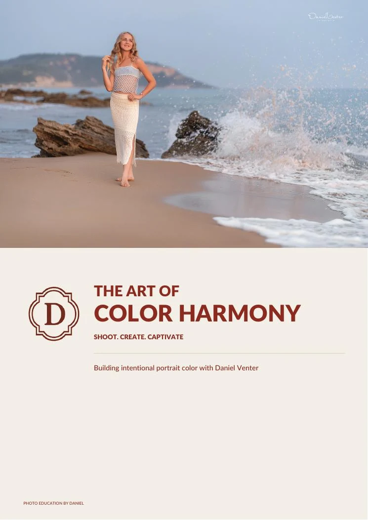
Portrait color, explained
The Art of Color Harmony
Build color into the portrait — before you press the shutter.
A practical guide to creating intentional, cohesive color through light, location, wardrobe, white balance and post-processing.
Instant digital access · PDF ebook · One-time purchase
The central idea
Color harmony begins long before the edit.
“Color is not something I fix at the end. It is something I build through the entire portrait.”
See the decisions
From the final portrait back to every choice that shaped it.
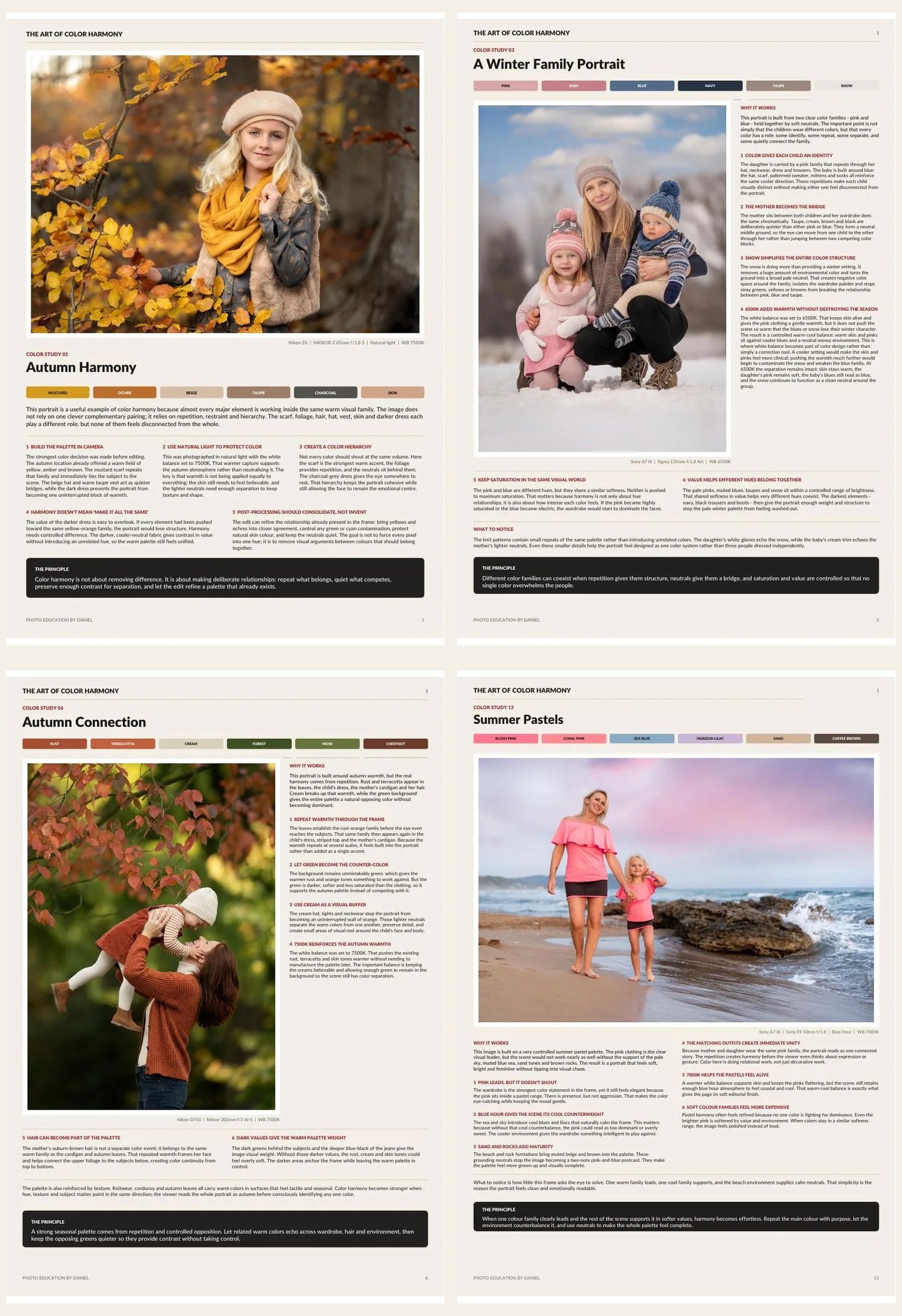
Each study breaks down the visual thinking behind the image. You will see the location, light, wardrobe and palette together—so the relationship between them becomes clear.
There are no presets or color recipes here. Each study shows what I noticed on location and what I decided, so you can make the same kind of call in your own light.
The five-part process
A connected system for intentional portrait color.
Shape the palette
Notice how direction, softness and reflection change every color in the frame.
Choose the environment
Use surfaces, foliage and architecture as active parts of the color story.
Create the relationship
Build contrast or harmony between your subject and their surroundings.
Set the emotional base
Make warmth and coolness an intentional choice at capture.
Refine, do not rescue
Strengthen the color structure that already exists in the photograph.
The aesthetic
Rich, restrained and emotionally coherent.
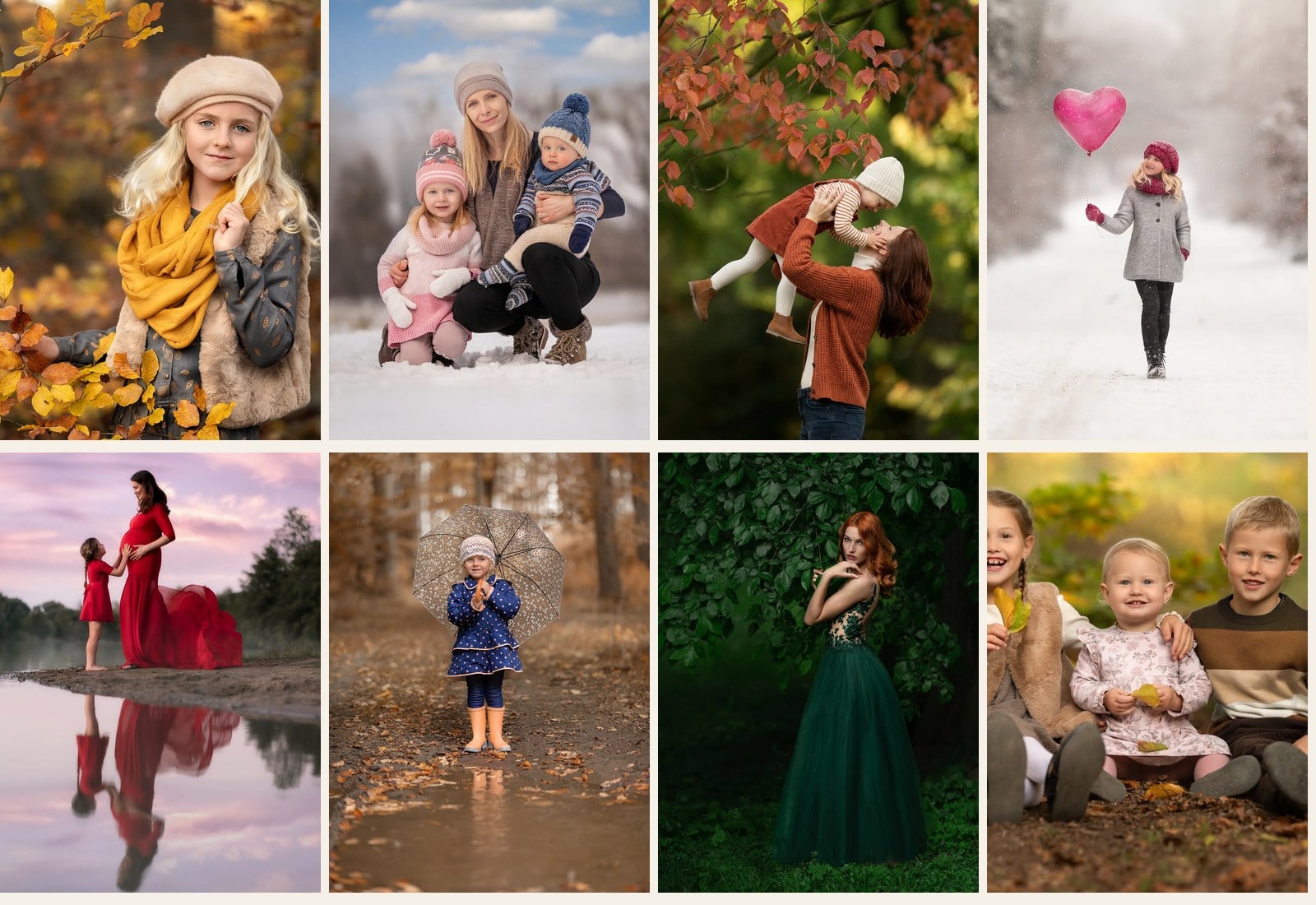
Daniel’s portraits are known for deep reds, earthy neutrals, quiet greens and luminous skin tones. The book shows how those colors are built together without making an image feel overworked.
What you will learn
What the twenty studies teach you
- How to read the dominant colors in a location
- How light alters saturation and perceived warmth
- How wardrobe can connect or separate the subject
- How to use white balance with intention
- How skin tone sits inside the wider palette
- How to simplify competing colors
- How to identify the emotional color of a scene
- How to carry the original idea through the edit
Inside the ebook
A practical field guide, not a theory textbook.
Complete portrait breakdowns
Follow each image from environment and styling through capture and final color.
Visual palette studies
See the key colors isolated, so their balance and hierarchy become easy to understand.
Clear creative reasoning
Understand why a decision works—and how to adapt the principle to your own voice.
Who this is for
For portrait photographers who want color to feel intentional.
This guide is for photographers who already care about light and expression, but want a stronger, more consistent relationship between subject, environment and edit.
- Natural-light portrait photographers
- Fine-art and editorial portrait makers
- Photographers developing a visual style
- Anyone tired of correcting color after the fact
The shift
Stop asking “How do I fix the color?”
Start asking: “What color story am I building?”
Once you can see the relationships early, your styling becomes clearer, your location choices become more purposeful and your edits become simpler.

About Daniel
Portrait education grounded in real decisions.
Daniel Venter is a portrait photographer and educator known for expressive natural-light portraits, intentional color and a clear approach to visual storytelling. His teaching focuses on the choices that shape an image before the shutter is pressed—and the restraint that keeps the final result believable.
Digital ebook
The Art of Color Harmony
20 complete portrait color studies · Instant PDF access · Learn at your own pace
Continue the study
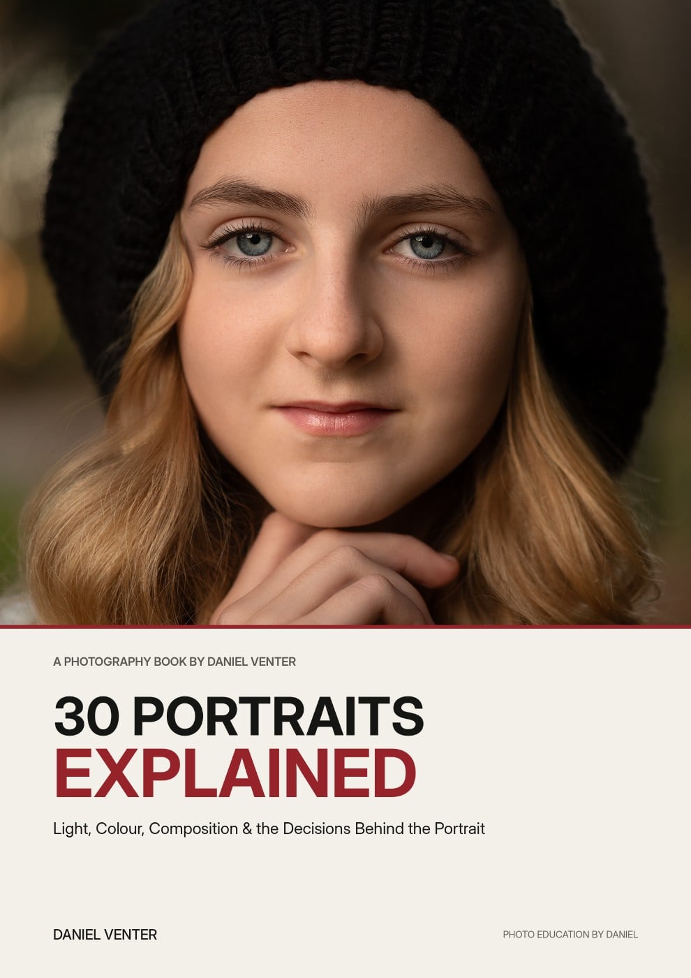
30 Portraits Explained
Go deeper into posing, light, composition and the decisions behind thirty complete portraits.
$29
A final thought
Good color usually starts before the shoot,
with the light, the location and what people wear.
This book shows you how I plan for it.
Questions
Frequently asked questions
What format is the ebook?
You will receive a digital PDF that can be read on desktop, tablet or phone.
How do I receive it?
Your download is available immediately after purchase.
Is this a Lightroom preset pack?
No. This is a visual and practical guide to building color through the whole portrait-making process.
Do I need advanced editing skills?
No. The focus is on seeing and planning color. The principles apply whether your post-processing is simple or advanced.
Will this work with my photography style?
Yes. The aim is not to copy Daniel’s palette, but to understand how to create a coherent palette of your own.