If building a cohesive colour story across a whole session is something you want to get more consistent at, grab my free Guide to Consistency from the membership page.
Creating a captivating portrait goes beyond the gear you use; it’s about understanding the nuances of composition, color, and lighting. This image of my daughter Amy, shot with a Nikon Z6 and an 85mm f/1.8 lens, perfectly illustrates the impact of color harmony.
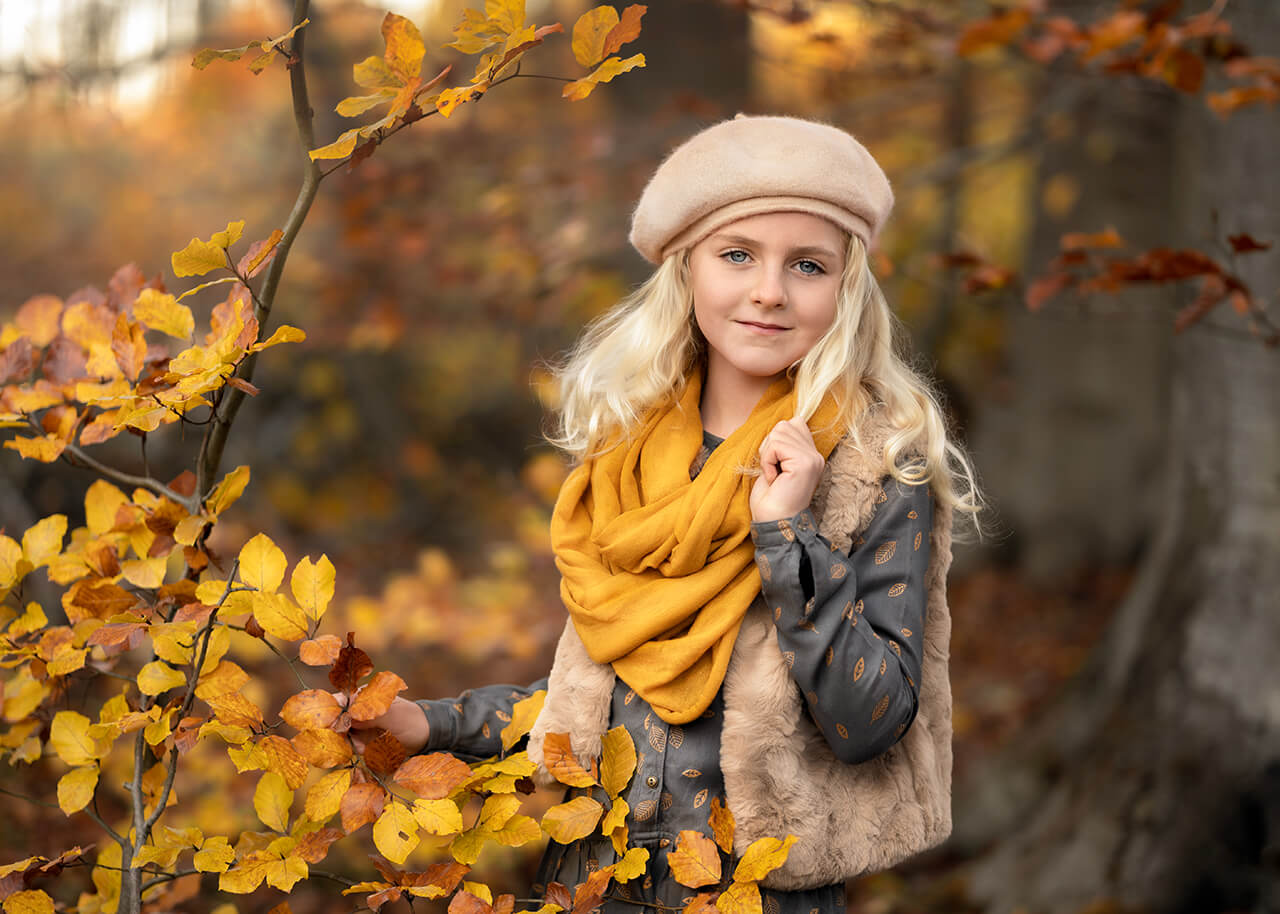
With settings of 1/320s, ISO 100, and an aperture of f/1.8, I achieved a beautifully soft background blur, drawing focus to Amy while accentuating the vibrant fall foliage. The warm tones of her scarf complement the autumn leaves, creating a cohesive, inviting palette.
Color harmony isn’t about the camera or lens; it’s about how you visualize and use colors to tell a story. Matching the mustard yellow scarf with the surrounding foliage makes the image feel intentional and connected. This technique helps guide the viewer’s eye, making the subject stand out without overwhelming the scene.
Here’s the same frame before and after the edit that shipped. Straight off the card, the light is flatter and a little cooler, and the foliage reads more brown than gold. The grade is where the color harmony actually gets finished — warming the highlights, pushing the leaves toward a richer gold, and pulling the scarf and the vest into the same family of tone so the eye has one warm story to follow instead of several competing ones.
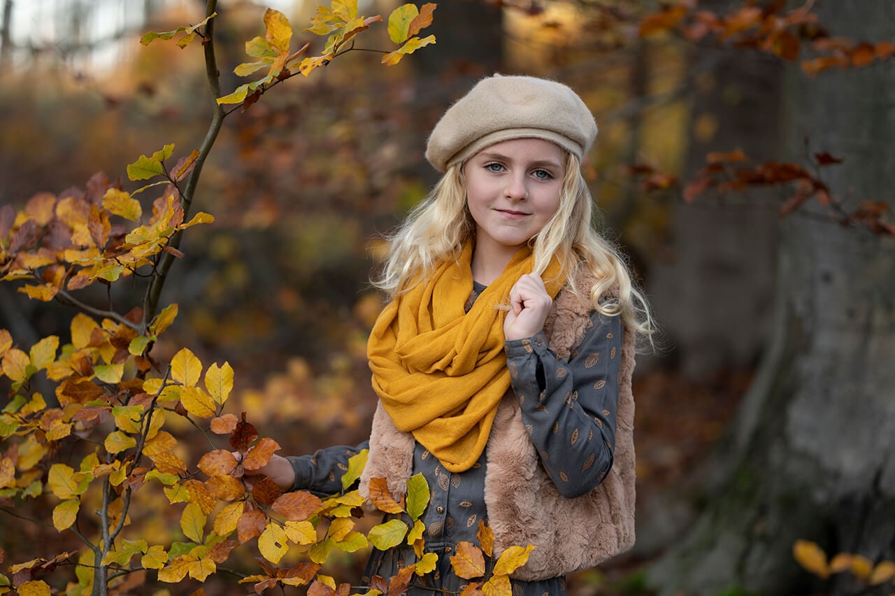
Before — straight off the card
158+ in-depth classes on light, colour, direction and composition — the exact process behind 13 years of paid client work.
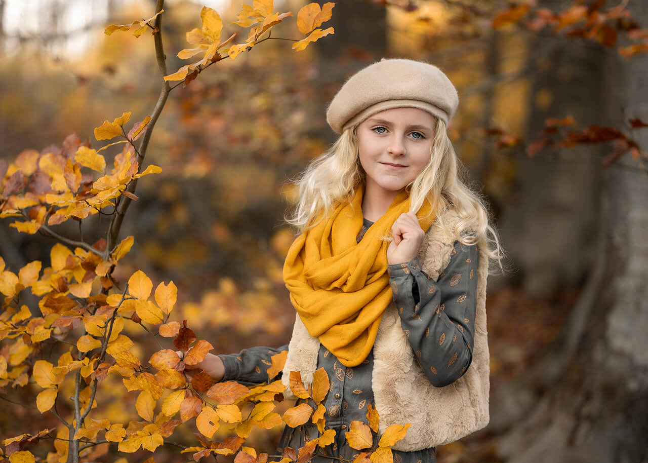
After — the edit that shipped
This was one frame from a longer session that afternoon, and Amy’s outfit changed more than once as we moved between spots — a color that worked against one stretch of trees looked out of place against the next, so the wardrobe had to keep pace with the location, not just the weather. The full walkthrough of that shoot, every location and outfit change, plus the RAW file itself, is part of An Autumn Portrait II if you want to work through the same edit yourself.
This portrait of Amy is a reminder that mastering fundamentals like color harmony can elevate your photography beyond the technical capabilities of your gear. By focusing on how colors work together, you can create stunning images that stand out in a crowd—regardless of the equipment in your hands. GET YOUR EBOOK ON THE ART OF COLOR HARMONY HERE
If building a cohesive colour story across a whole session is something you want to get more consistent at, grab my free Guide to Consistency from the membership page.
Lifetime Access
The complete light, colour, direction and composition system behind 13 years of paid client work. 158+ classes. 6,000+ photographers inside.
New
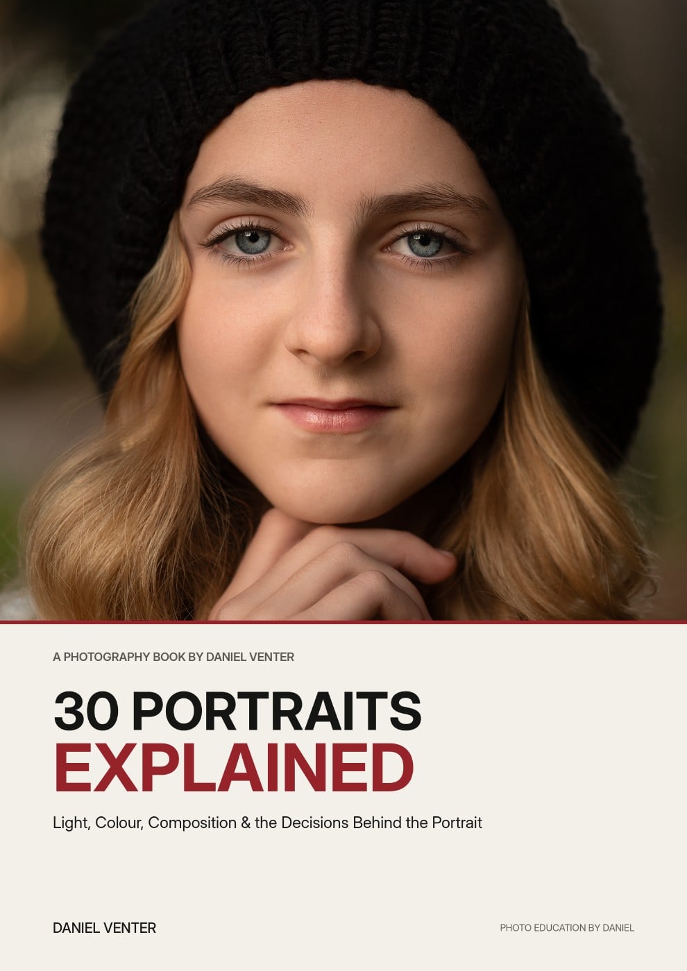
Thirty finished portraits. Thirty complete breakdowns of the light, colour, composition and decisions that shaped them.
Get the Ebook — $29
Free
Grab a free guide and preview the exact process taught inside the full system.
60 minutes, 1:1, on your actual portfolio — plus a written action plan.